Monday, November 29, 2010

logo feedback

I think I've realized that the goal of my (currently) very focused life is to end up as part of a building team within the next couple years. The solo projects have been a great way to meet people, and now I feel like I've linked myself into a community of builders/artists/thinkers who might be interested in collaborating year-round. 

In an effort to visually organize my journey thus far, and be able to communicate myself clearly to people, I've been working on a website that I hope to bring to life in the next couple weeks. It's taken a while to decide on a name, but after searching and searching with tea and a couch ("fit buildings," "appropriate structures," "fantasy cob," etc... - boring, boring, weird...), I've come right back to "cob & on." I feel now like I need a visually identity (it might be the design school graduate rooted in me), and so I devised a logo last night. I'm looking for feedback about it. What don't you like? What does it make you think of? Is the name confusing? These sorts of things. Thanks! 

*(note: I want to keep it just one color)


Sunday, November 28, 2010

update: Danielle's Tower

 I spent the last 2 days working on Danielle's cob house in Silk Hope, NC. It's always fun to spend time on the land, and work with Danielle. Our friend Steve was also out (the guy on the roof below). Steve works for Habitat for Humanity, and took Danielle's workshop earlier in the summer. He's been coming back ever since on his time off to help build, as well as donate Habitat's scrap materials to Danielle's project - a great resource!

The house is looking incredible:


I love the exterior steps. The boards extend all the way through the wall (18 inches), and feel amazingly solid underfoot. I go up and down all of the time without worry.


Here is the little porch to which the exterior steps lead. It can also be accessed from the second story room, through the tiny doorway that you see.


Most of what I spend my time doing this past weekend was installing fascia boards. The fascia boards follow the perimeter of the roof and are what provide a barrier for soil to rest against (it's going to be a living roof). There are some important details that Danielle and I dreamed up, that make it a very solid green roof solution (we hope). The first element is the triangles, which you can see below. There is one for every rafter, and they are secured with screws down into the rafter.


Each fascia board is measured, cut, and then attached from one triangle to the next. The hard part is maintaining an aesthetically pleasing flow from one board to the next, to the next, to the next.


 Here you can clearly see how the triangles hold the fascia boards about 1.5 inches away from the edge of the decking. This is so that when water gets onto the fascia and rolls around the face of the board, it won't then be able to continue rolling onto the decking, but will instead drip to its death. As a living organism, I love water. As a builder, it's terribly frightening.


 Because the fascia boards are all scrap cutoffs from a neighbor's barn project, there was little continuity among pieces. I had to do a lot of custom chisel work to get the boards to match up (you can see the big chiseled oval shared by the two boards in the photo).


All the roundwood looks incredible! The lower, secondary roof that you can glimpse under the hanging plaster is going to be a roof over an outdoor bed, and still needs to be decked.


The fascia are now complete, and Steve has started to install a layer of blue foam insulation over the entire roof (all scraps from Habitat). The next steps: 1. finish the insulation layer, 2. lay out pond liner on roof, 3. install cushioning layer of carpet underlay over the pond liner, and 4. bring up soil and plants to the roof! There are definitely a lot of details amidst those 4 basic steps, but we're getting close...

Thursday, November 25, 2010

Ideas in the name of food.

I was thinking today that I should design an outdoor kitchen to build and use next year during the project. And then I thought: how ridiculous, to build an outdoor kitchen for just a couple seasons of use (my parents enjoy the outdoors very much, but I see them more as indoor-kitchen folk). This led me to consider what my parents do want/need. And I think a greenhouse fits the bill, especially if they are going to be living here initially in the winters.


Below is a rough model of the greenhouse. It's about 8X10, interior floor space. The main four panels of glazing will be glass. The rest of the translucent openings will be plastic sheeting (both because it can be cut into different shapes easily, and because it doesn't need to be framed in with wood, so it can extend past the framing to keep water at bay without caulk, flashing, and other fancy drip details). The North wall will be an 8 inch wall of cob inside a 5 inch layer of slip-straw insulation infill (straw dipped in clay slip). The cob will act as a thermal mass to store the sun's heat, and the straw will keep this heat inside. The roof will be shingled (to save money over metal) - I would consider a green roof, except that it would require a much beefier frame to hold the extra weight, and I want to stay as light on materials as I can. The floor will be gravel, raised about 3 or 4 inches above ground level (for drainage). There will be a work bench along the north wall, for working with seedlings, and a full-length raised bed running along the south half of the building, leaving a small path running east-west down the middle (and with a door at each end). I'll have to put in some opening windows for ventilation, and perhaps some screens.


Before it becomes a greenhouse, it will serve as our outdoor kitchen (essentially a roof, under which there is an appropriate area to hang shelving, install a sink, and use a stove, without some leftover room for counter space. It will also have to have a pantry and/or cool box of some kind, but I haven't thought much about it yet. Here is a basic idea of what it will look like as a kitchen, before the cob/strawbales go up, and with a (blue) tarp over the front windows, to keep it cool inside:

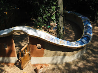
FInal, belated update for the Cob Garden Wall

I found a goldmine of backyard garden wall photos today! I could very well be mistaken, but I don't think these were ever posted. The last time you saw it was probably like this:


And then a lot more happened...


Decking the roof with 1X6s (notice how much the color of the cob lightened when it dried):


Extending the roof framing over the gates:


Applying stucco over the concrete block. This particular photo was taken a day after I stuccoed - it looks pretty neat and tiger-stripe-like as it dries. Eventually it all dried to be a consistent, boring gray.


Plastering the wall (with clay from Pickard's Mountain - the same plaster in the interior of Margaret's cottage):


Plaster detail around the little arched window:


The quality of light..... ahhhhhhhh....:


This is the view that my nephew will have of the wall, at least for another year.

In the above photo, notice how nicely and evenly the edge of the decking is overhanging the end of the rafters- about an inch and a half all the way around. I thought it was a pretty great aesthetic move. After it was all done, I thought to myself: "now what am I going to attach the fascia boards to?" Previously, I had attached fascia into the ends of the rafters, because there was no overhanging decking in the way. I ended up having to go around and attach a block of wood at the end of every rafter as a solution. It was time-consuming, and a great reminder to NEVER MAKE THIS MISTAKE AGAIN.


Although a completely different style than the house, I like how they look juxtaposed next to one another:


The first layer of the green roof was carpet underlay, from a nearby carpet store dumpster:


The next step was to put the impermeable plastic layer over the entire wall, and then wait for a praying mantis to bless the project:


The fascia boards went on after the plastic, to lock it into place:


Then pool liner sample scraps over the plastic. (And a layer of dumpstered carpet on top of this):


And then soil/compost! (which needs to be planted eventually, with sedums).


Wednesday, November 24, 2010

Just some photos

The latest work on the shed has been: 1. to organize the interior a bit better to make it feel more peaceful and easier to be in, 2. finish the windows (this involved cutting glass, which I found to be extremely satisfying!), 3. install insulation in the ceiling and then cover it with a thin sheet of plywood (still needs a line of trim down the middle), and 4. start the exterior plaster!


My dad asked me what the light-colored patch of the exterior plaster was all about. It's very simple - Danielle started plastering last week, as I was installing the windows - and then it got dark. Danielle's patch represents the finished, dry color of the plaster. The darker stuff is fresh and new.


Tuesday, November 16, 2010

Permit attempt #1

One of the big elements of my current project (which is at this point invisible) is that the intention is to achieve code-approved, permitted status. In fact, if I were to fail in this regard, the project would simply not happen, as my building lot is in an urban (i.e. visible) area.

I have been very slowly working to collect together what I hope are the necessary plans for a building permit (utilities will come soon after). I am using a combination of Google Sketchup (free) and the trial version of Adobe Illustrator CS5 (free, but limited to 30 days) to create this document. It is a healthy mix of renderings, boring cross-section diagrams on rigid graphs, and graphic icons.

Below is a generous sample (everything but a couple of redundant diagrams):


One of the nice things about Sketchup is that it allows you to view your model with different styles. Here is a three-quarter view in "pencil on light brown:"


The foundation has one open wall so that I will be able to store materials underneath the house, and crawl in to access plumbing and gas utilities. The reason that the foundation sticks out past the edge of the building by 8 feet is because I am planning ahead for a porch addition.


The framing for this part of the house is conventional for two reasons: 1. in an attempt to get a permit quickly, and 2. I will able to build it super-fast, (and deal with my guilt later). In short, I need a place to live this winter, and winter is right around the corner.


The very simple floor plan:


Diagrams, diagrams, diagrams. It took me a while to figure out how to do these. I wanted them to be digital, so that I could easily e-mail them, print them, integrate them into documents along the way, and - most importantly - modify them. I couldn't find a way to get a tight enough output using Sketchup - the renderings are really loose and (you guessed it) sketchy. So I ended up creating them from scratch in Illustrator, which looks tight, but is time-consuming and frustrating at times. Any software suggestions would be appreciated.


I have to give credit to my good friend Dan at Stony Creek Farm for the following drawing. I really love the simple, iconic schematic that he drew up for his house, and appreciate his generosity in sending it to me as a reference. It's a really elegant explanation of the plumbing. For the record, I didn't actually "steal" any of his document, but made it all myself in Illustrator - but the value is in the idea, and it's a good one.


I'm going to take everything into the city tomorrow, and see what happens. The experiment here has nothing to do with natural materials (I wanted to save that battle for much later); instead, it's just an attempt at a permit by someone who has no training in conventional construction. I have involved no engineers, no architects, and no professional builders.

For clarification, this little rectangular structure is just the beginning of my project - just enough to give me a place to live with a bathroom, kitchen, and sleep spot. The meat of the project will come as an addition to this building next season, and will be full of mud, strawbales, rough-hewn timbers, and passion.